
I hardly ever (as in never) post two days in a row, but this was just too hard to pass up. Those of you who follow my other blog, The Year of Writing Dangerously, may have seen my recent post on judging a book by its cover. After reading a couple of yesterday's comments, which ranged from dislike to support for the cover of Stones forMy Father, I couldn't deprive you all of a comparison between the two covers available (and the Don's running a book on which one is going to garner the greater support.)
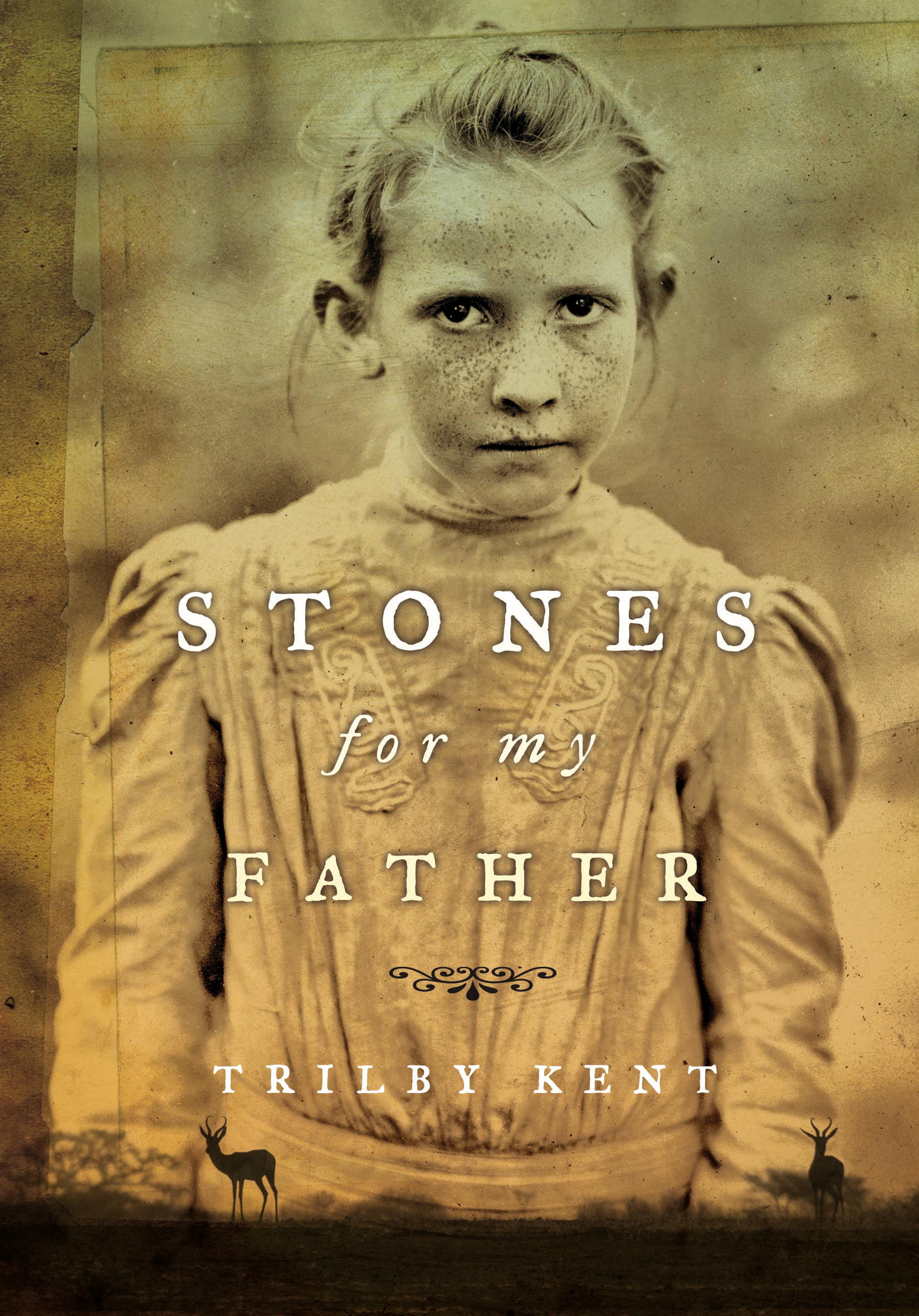
The cover on the left is the one for the book I read for the Cybils. I must admit I was not immediately attracted by the sepia tones, but there was something haunting about the young girl's eyes. I could also immediately glean from her clothing that this would be a story set in the early 20th century. I didn't immediately think "Africa," because I only scanned the animals on the cover, and thought they were deer, rather than springbok.
I saw the cover on the right when I googled the cover images, and I immediately thought "British." Further investigation shows me that I'm probably right--the image comes from a British woman's book review blog. I'm not sure why I thought it was from my country of origin. Is it the italic typeface for the title? You're left in no doubt this is set in Africa, with the big old obvious giraffe. But you would not immediately suspect the era is 1901--the girl's look and clothing is much more contemporary.
This sort of sleight of hand can sometimes be annoying. I remember thinking that the cover of Phoebe Snow's The Romeo and Juliet Code (which if you haven't yet read, you must) would be more contemporary, although it's set in the early 1940s.
My guess is that young people would be more likely to choose to read this book based on the greater vibrancy and more contemporary feel of the second (British) cover.
What do you guys think? If you have a youngster available, why don't you conduct an experiment and let me know their opinion?
You are right, I think. I do like the bit of orange in the British cover, and the girl on the US one, although very true to the descriptions of her in the book, is kind of scary and off-putting. There's no doubt about the historical setting of this one once students start the book, so I would prefer the second cover as well.
ReplyDeleteIMHO, the cover on the left is by far superior. Maybe I'm just tired of pretty girls on covers?
ReplyDeleteMy daughter preferred the one on the right. The girl on the left made her too sad. She loved the giraffe and the tree on the right cover and immediately knew the setting was Africa.
ReplyDeleteI think historicals have a tough time of it when it comes to covers and garnishing a younger audience.
Wow, I can barely believe that these are covers for the same book--mostly because the girl on the right is so much older! Michael, I agree with your assessments of both, especially that the one on the right is more contemporary-looking and more clearly about Africa...but I also find the one on the left more unique. Who is this intensely-staring girl, and what is her story? It may be a worse fit for the content, but I think I'd be more likely to pick it up.
ReplyDeleteThe only youngster in the house at the moment is my three-year-old, and she's busy watching Dora the Explorer. I would tend to agree with you--the one on the right would probably appeal to younger readers of today, but I like the one on the left better :)
ReplyDeleteI love the first one.
ReplyDeleteI agree that the one of the right looks too contemporary. Never would associate that style with 1901. So with that in mind, I'd probably go with the one on the left.
ReplyDeleteI love the cover on the left. I like that the girl doesn't look like a model. It feels authentic.
ReplyDeleteBut I agree with everyone else that YA's would probably pick the book on the right, because the one on the left would make them think "historical" or "biographical" and even though this is sad - they might equate that with "boring."
I also agree about Romeo and Juliet Code. At first glance i thought it was a contemporary romance.
oh dear...I would def pick up the left one...
ReplyDeletebut I'm old..:)
...something in that child's face... the story
I asked my two daughters (10 and 15) and they both liked the one on the right a lot better. My eldest even said she wouldn't have picked the left one if she saw it at the library. She's not into historical novels, and this didn't appeal to her at all. I have to agree with her. I liked the one on the right better too. The other one seems a little depressing.
ReplyDeleteMy 11 year old goes for the one on the right.
ReplyDeleteI like them both.
Such an interesting discussion, Michael.
Hmmm.